ELEN: an app redesign for procurement
A new interface design for ELEN, a procurement management tool for project-based manufacturing. We designed how the app can make enquiries, offers and the bill of materials status easier to follow. Our sister studio nkz.studio created its brand strategy and visual identity.

The app worked, but it did not speak like the brand
The original app did its job: projects, bills of materials, enquiries, offers. But it looked like a generic admin. Charts and coloured tiles sat side by side with the same weight, and nothing said what to do first.
The new strategy gave the brand a voice of its own: ELEN speaks for herself, in the first person and calmly. She promises the calm of knowing every part is taken care of, and leaves the decisions to people. The redesign carries that voice into the interface: ELEN says what she has prepared and leaves a button for the buyer at every step.
The ELEN brand manual in BranuálThe same screens, a different order of importance
Drag the handle to move between the original app and our design on the new identity.
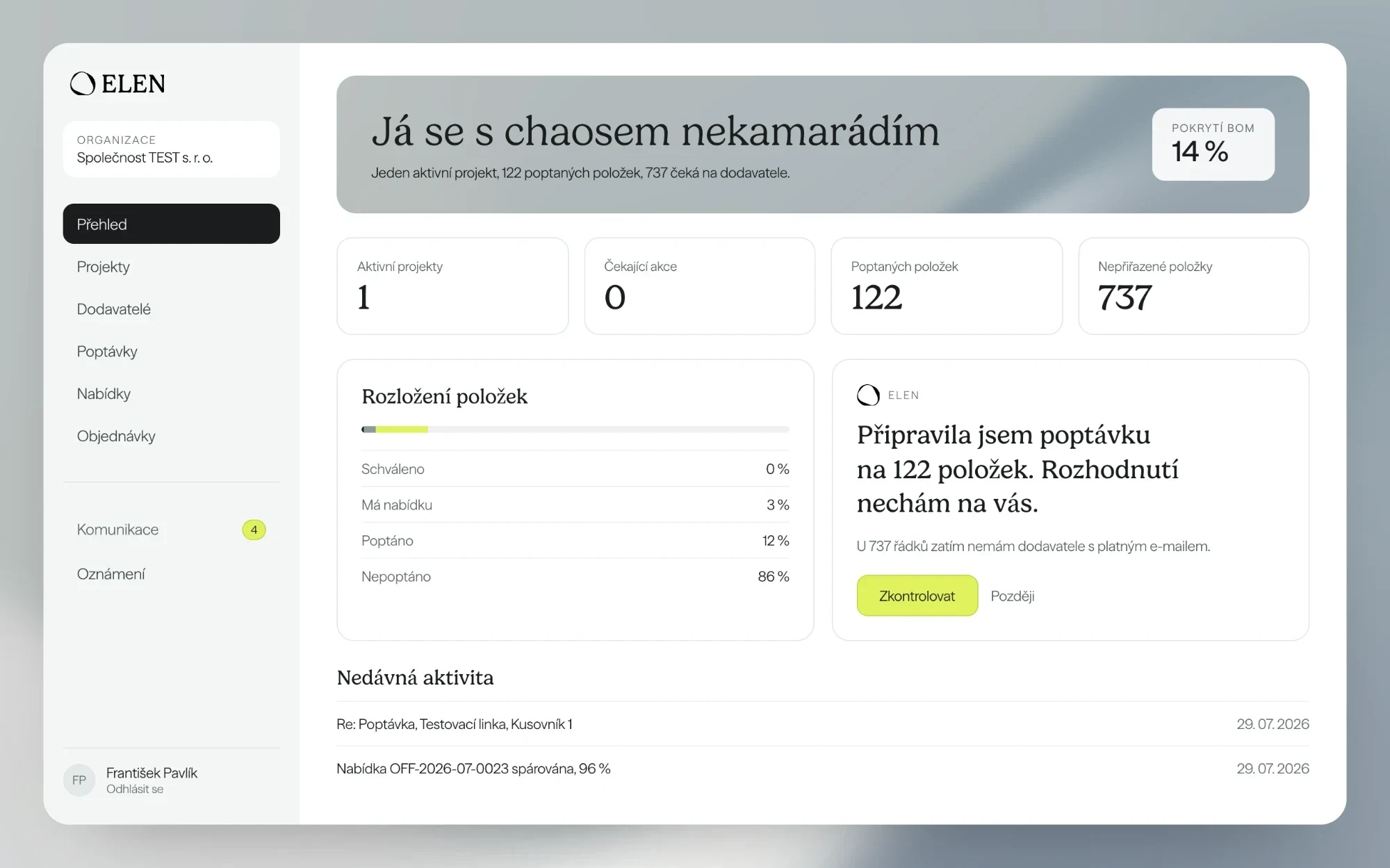
The overview starts with a sentence, not a chart
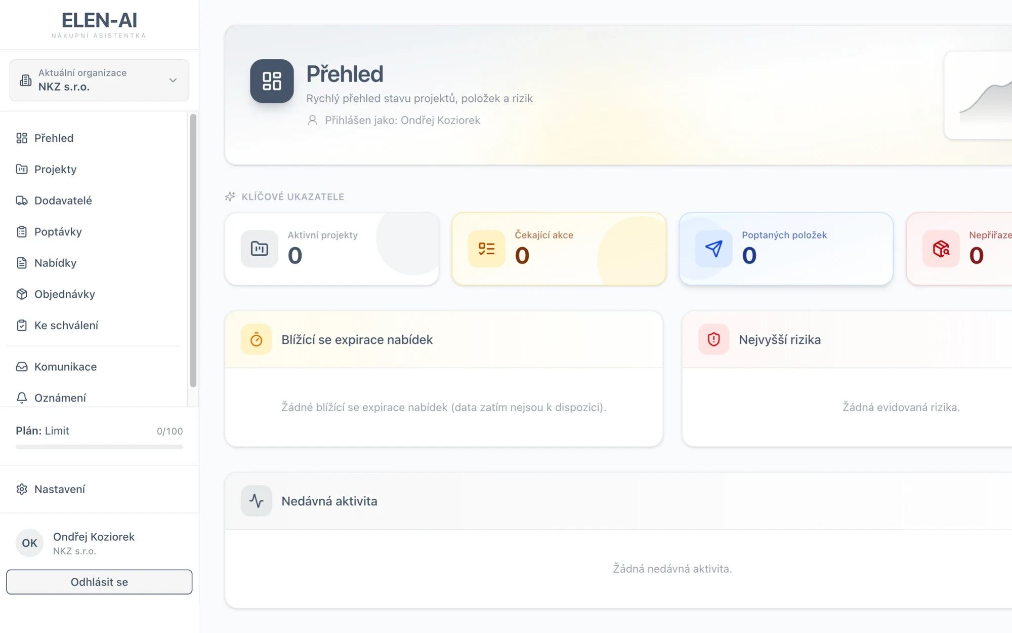
The original overview put tiles in four colours, a decorative chart in the header and expiry and risk panels side by side, all with the same weight. The new one starts with the project status in one sentence and the bill of materials coverage. Next to the item breakdown is a card where ELEN says what she has prepared and what needs checking.
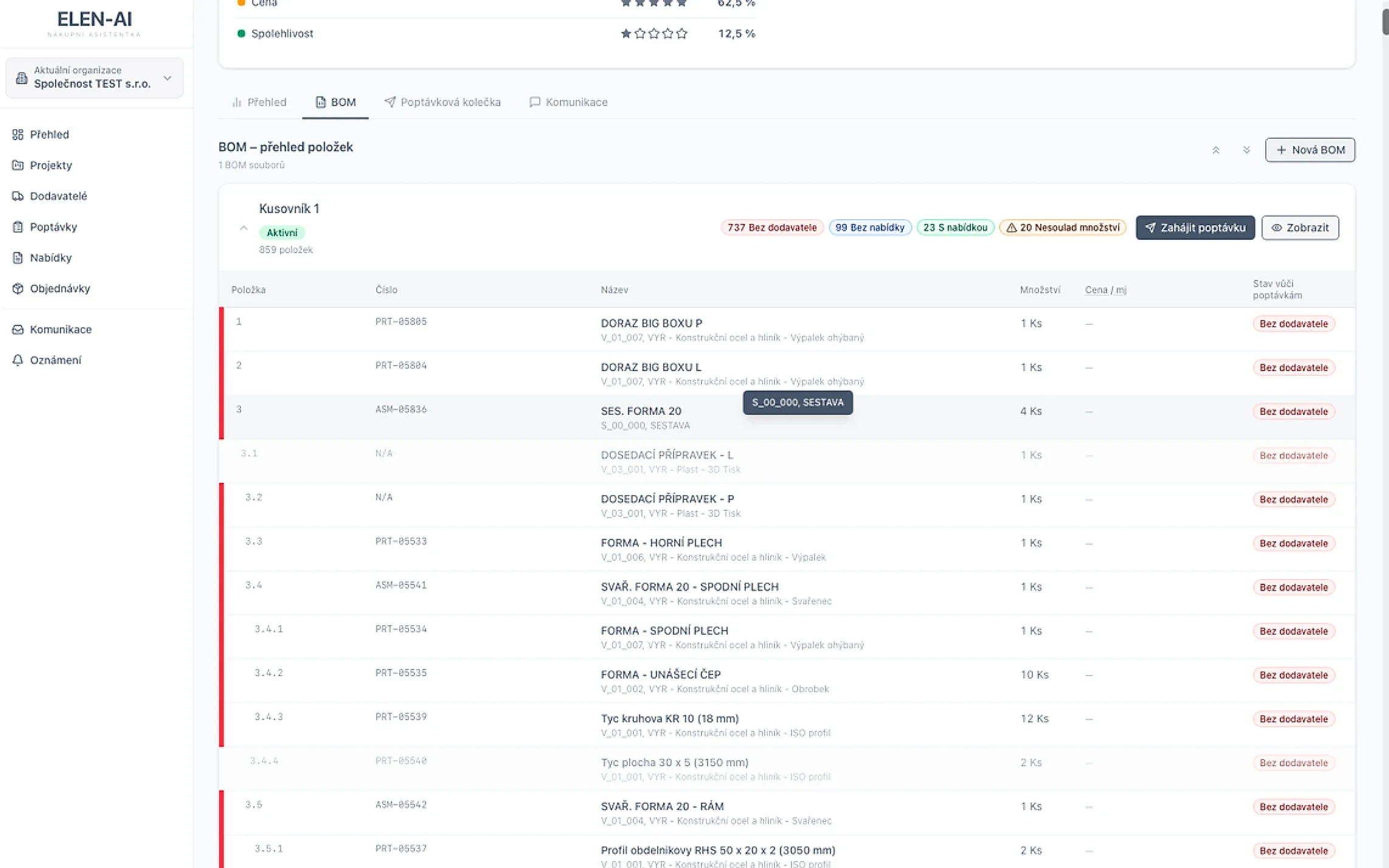
A bill of materials that shows what is missing
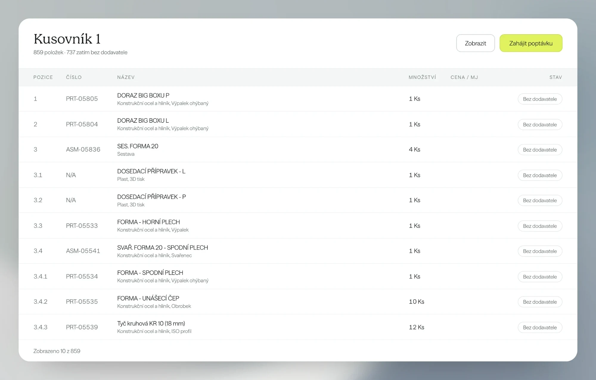
Hundreds of rows with position, part number, material and quantity stayed. The red bars on every other row and the technical codes in the description went. An item’s status is one label on the right, and the enquiry starts straight from the header.
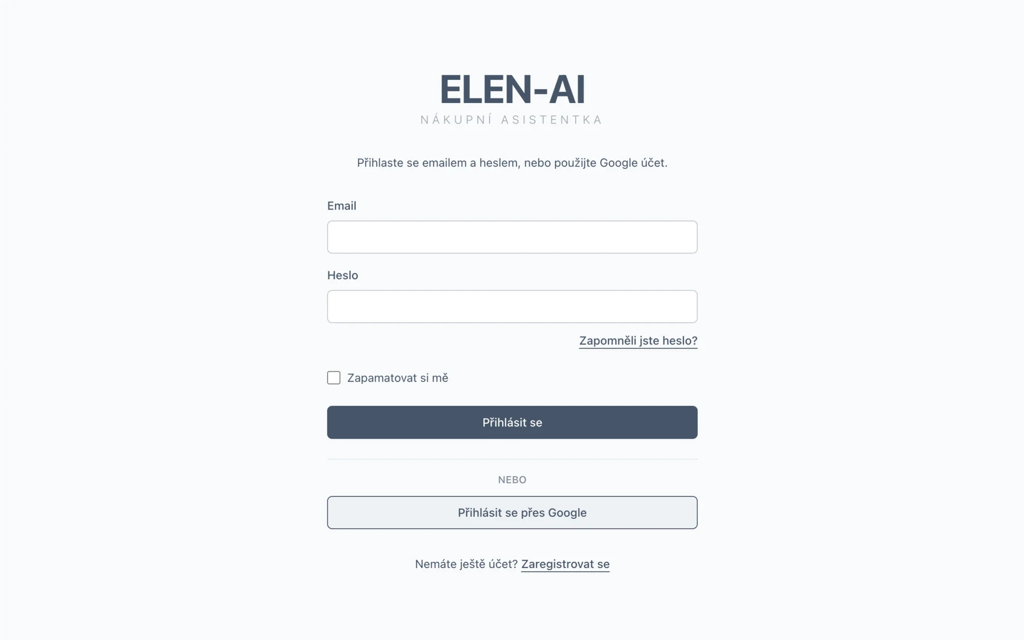
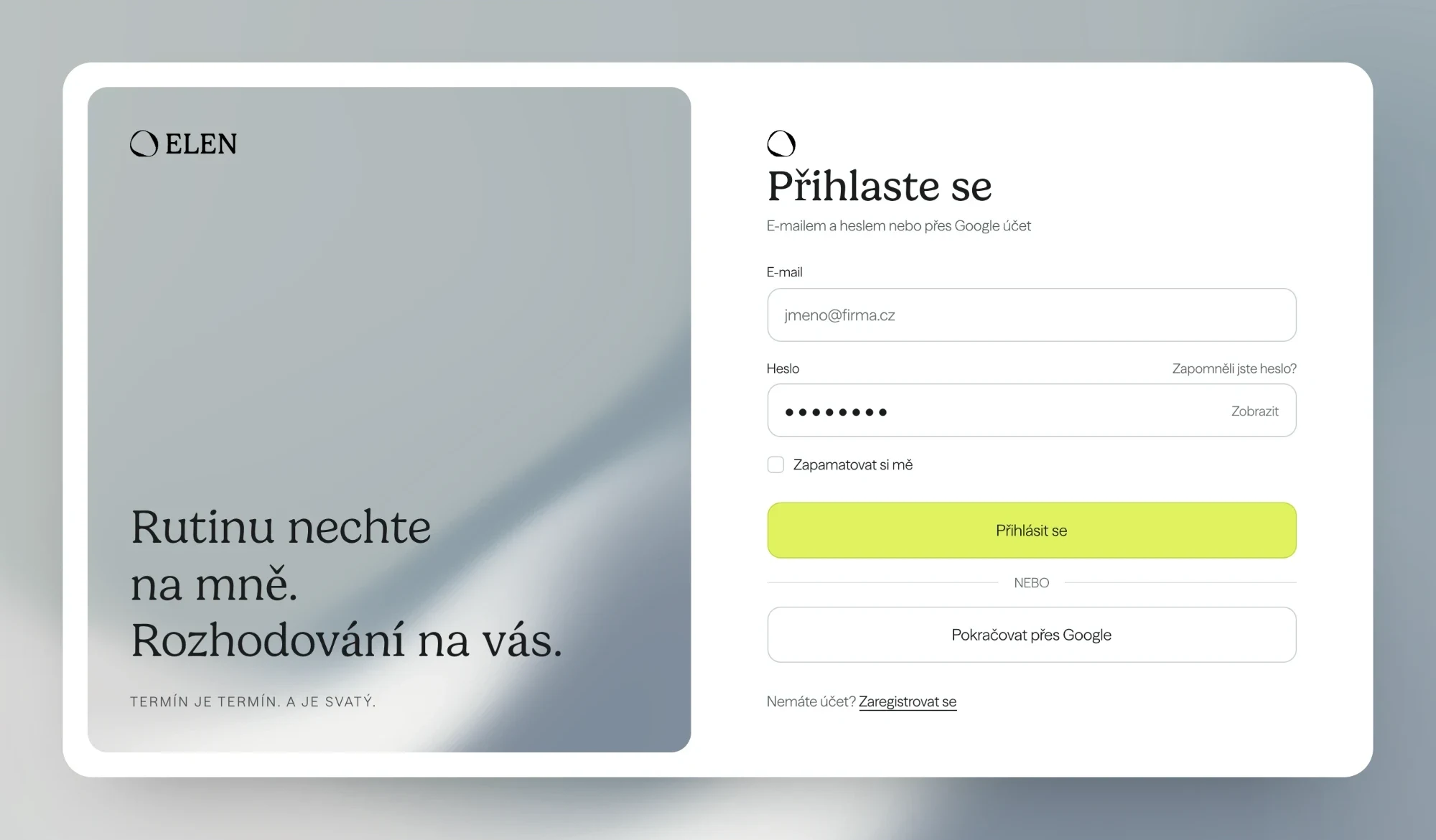
A sign-in that already speaks like the brand
The form stayed the same: e-mail and password or a Google account. But the left half carries the sentence from the identity and the brand gradient, so the first screen speaks like the rest of the app and the website.
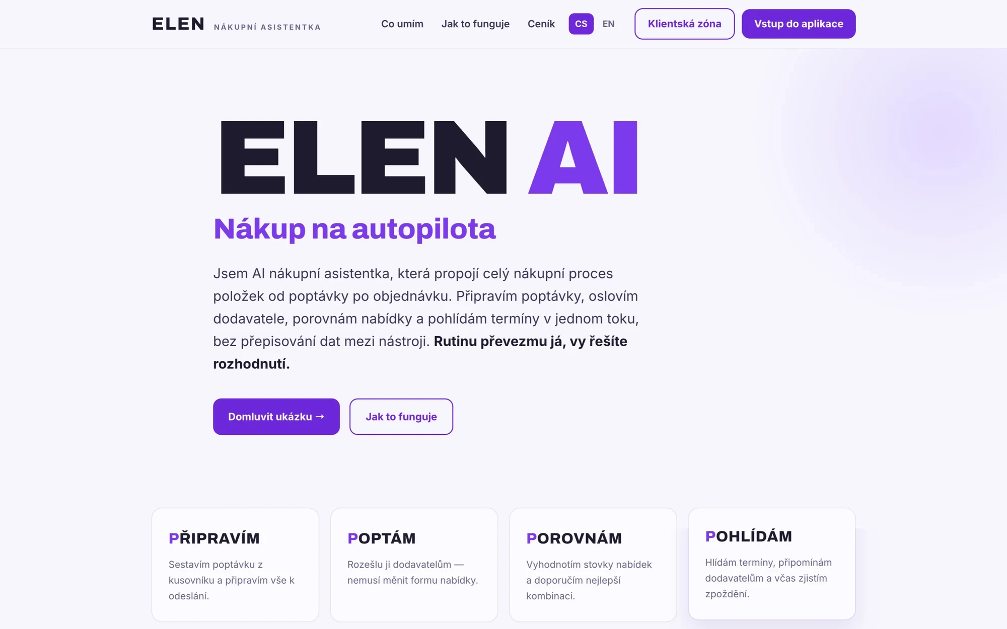
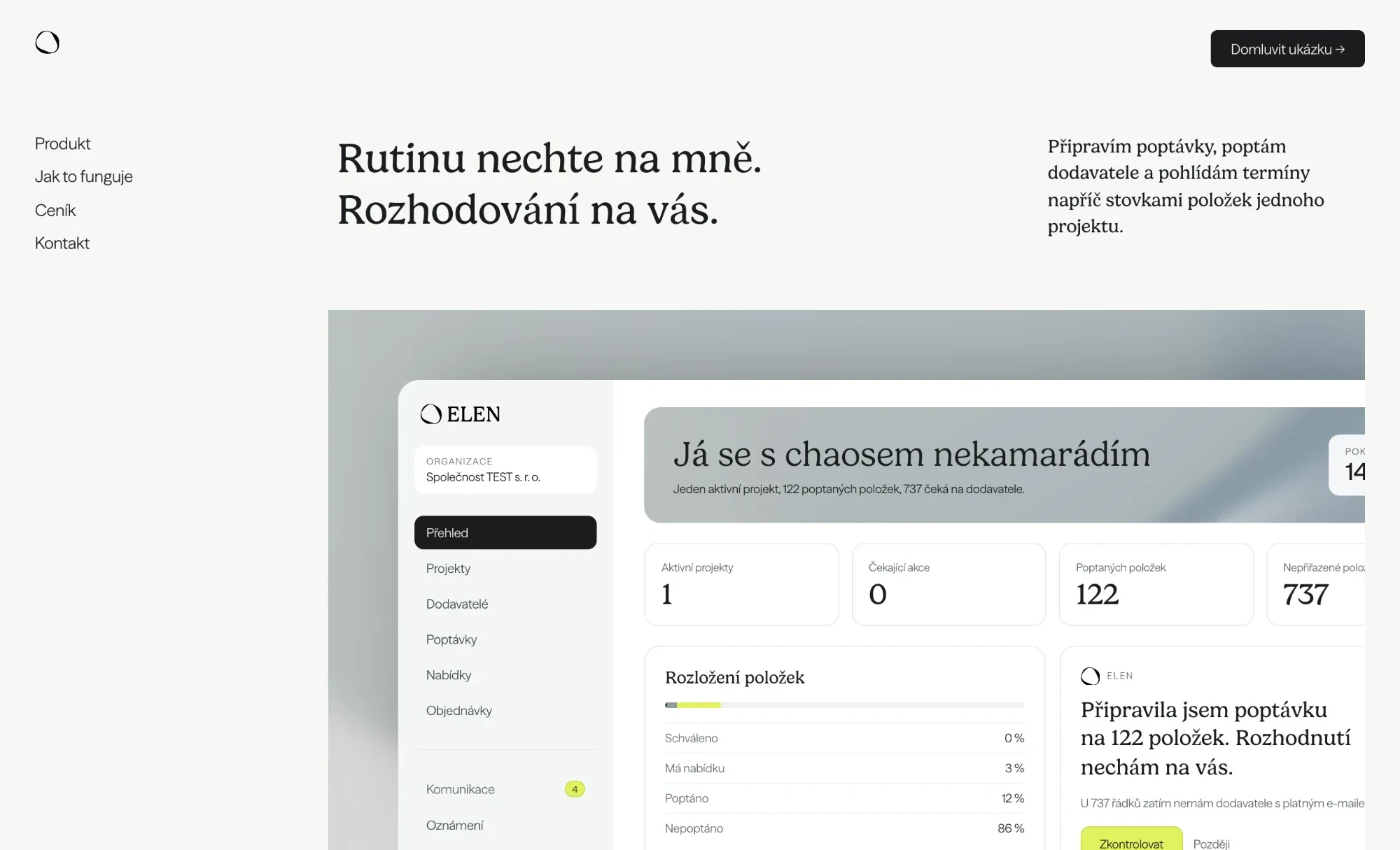
A website that does not start with the word AI
The original site rested on the ELEN AI lettering, a purple palette and the promise of purchasing on autopilot. The new one opens with a sentence from the identity, in which ELEN speaks for herself, and right below shows a real screen of the app.
Have an app that works but does not look the part?
Tell us what you have and where it holds you back most. We reply within two business days.
What else we built
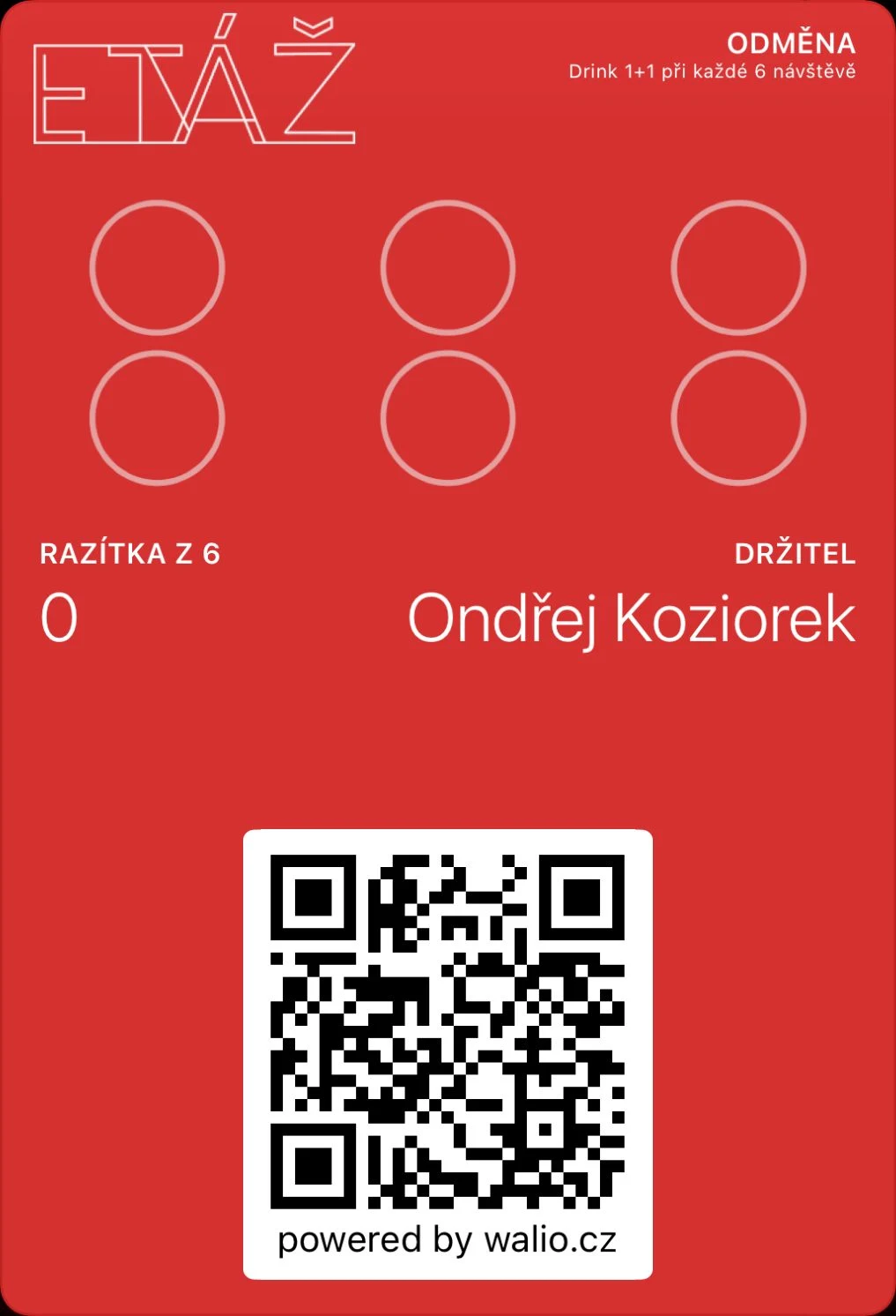 Walio: a loyalty system for businessesA card in the wallet, a terminal for staff and a portal with reporting.
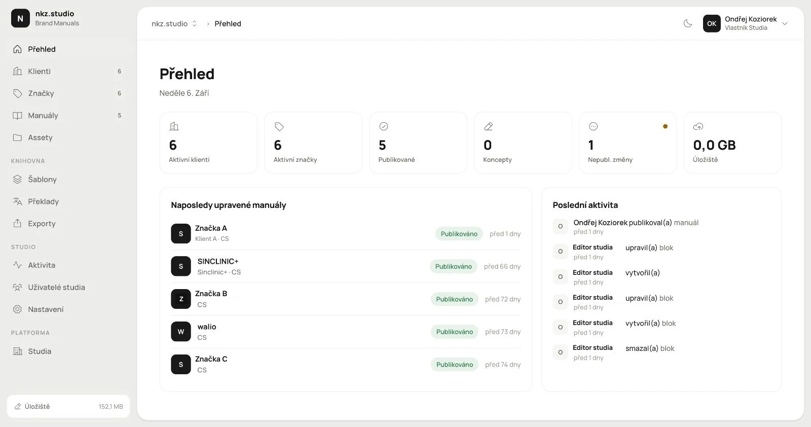 Branuál: a brand manual as a website, not a PDFPages, blocks and an asset library with publishing. Our own product.
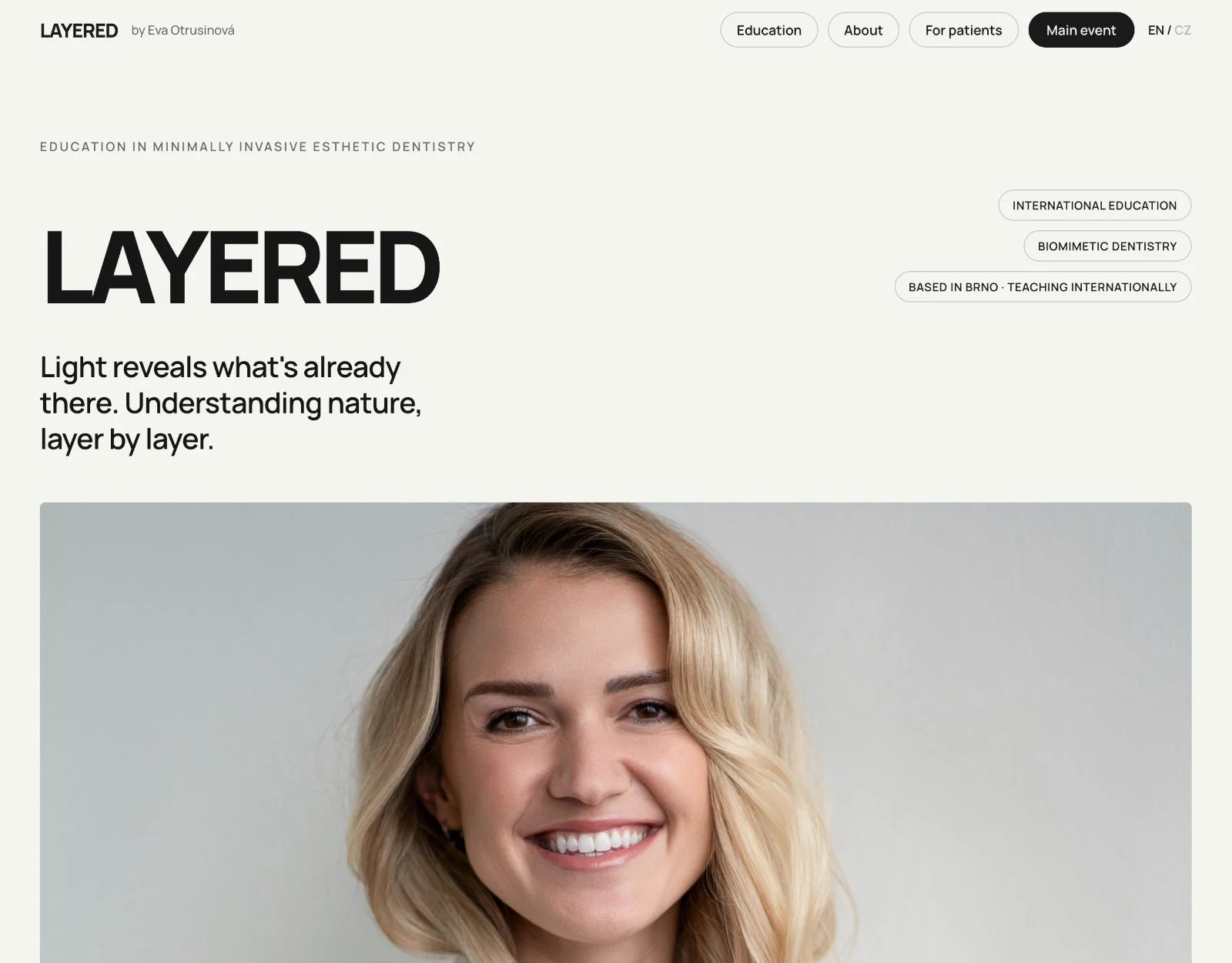 Layered: a website that sells the course and checks the guest inBooking with live capacity, payment and confirmation in one place.