
A brief is not a list of screens
Most projects arrive as a list: we want a login, an overview of jobs, an export to Excel. That is a list of features, not a brief. A brief says what a person at a computer has to get done and how long it should take. The difference shows up in production, when fixing it is most expensive.
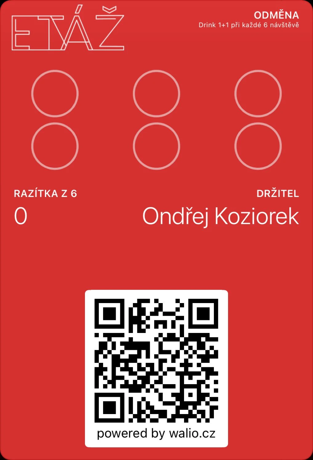
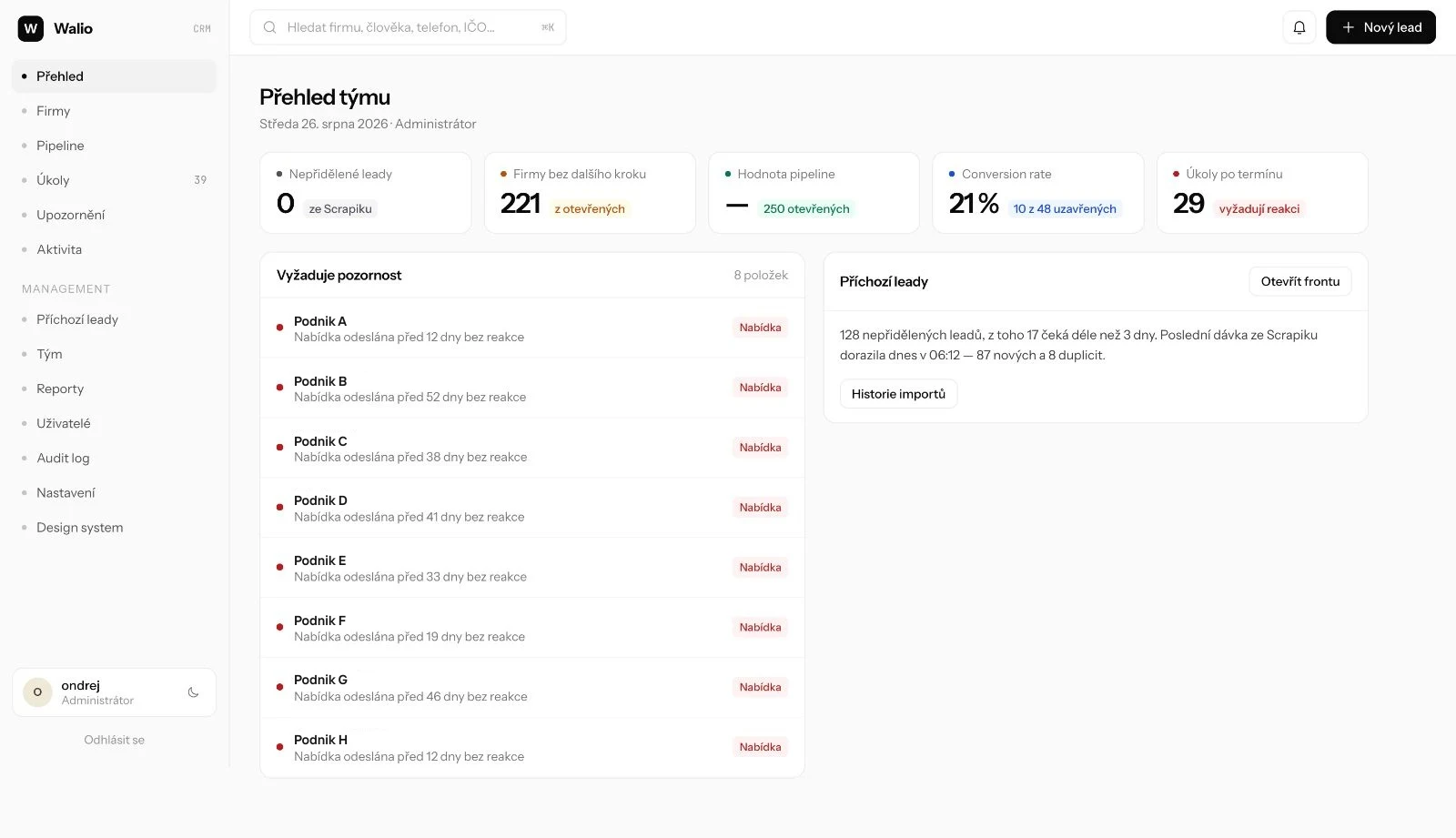
So we run the first meeting as a conversation about that person’s day. At Walio the question was what the staff behind the bar do when three people are queuing. At Layered it was how attendance on a course is recorded today. The answer “on a printed list” changed the whole data model.
Until we know what the person has to do, drawing screens is pointless.
Structure before visuals
The second step is a map: what states the system has, who sees them and what happens when something is missing. Without it you get interfaces with three routes to the same place and none of them complete. We do this part in text, not in a graphics tool, because it is easier to cut things there.
What the map has to contain
- A list of roles and what each may see and change.
- The states of a record from creation to archiving, including the awkward ones: cancellation, duplicate, missing value.
- The places where another system is involved: payments, invoicing or stock.
- What happens with no content. An empty screen is a state too.

We check key behaviour before development
We work out how the interface behaves before any code is written: what happens with a long name, how it breaks on a phone, what an empty list or a missing value shows. Postpone those questions and they come back at the point where answering them costs most.
On projects we develop ourselves, we check the key screens in a browser preview. When we prepare a standalone UX/UI design for your development team, we hand it over as a presentation with screens, states and a map of roles. The difference lies in how the design is checked, not in what it has to give the team.
Once the home page and one inner page fit, the rest is repetition. When we build it ourselves, we check the key pages in a browser preview and collect comments right there. For a standalone design, we prepare a presentation that we go through with the team screen by screen. We use the same approach for custom websites and for internal applications.
How it plays out on a single step
Take one screen from Layered: picking a date and paying. On a feature list it would read “course booking with card payment” and could be built in a day. In the map of states, though, one question came up: what happens between the click on “pay” and the confirmation from the bank.
The answer “nothing yet” means that with one place left and two people in the payment gateway, the place is sold twice. The client would then be sorting it out by phone and issuing refunds. So bookings run inside a database transaction and a payment in progress holds the place for fifteen minutes. Better that a customer sees “sold out”.
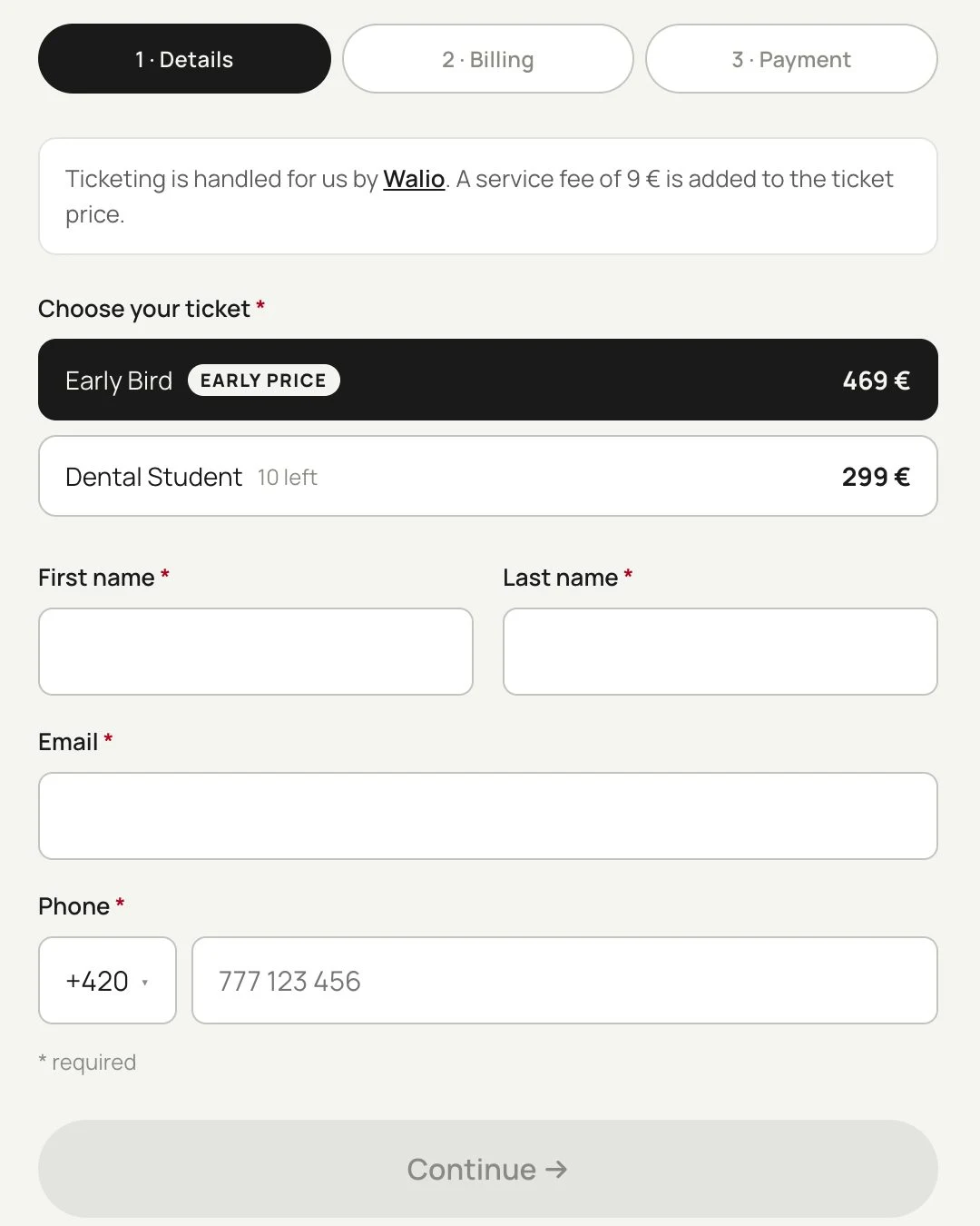
That is the whole difference. The decision took ten minutes of conversation and one line in the map of states. Arriving after launch, it would have meant rewriting the booking model in a system that already had paid orders in it. Designing up front does not save development time; it saves exactly these situations.
What it saves
It is not that design shortens development. It shortens rewriting. On projects where we started with structure we did not have a single case of a finished screen being thrown away. Where we used to start with code, it happened regularly.
A side effect: the brief can be handed on. When a client comes back a year later with an extension, they read a map of states, not someone else’s code. That keeps the price of development down, not just the price of the first version.
When not to design up front
When it is one page with a clear action, or a small change to a finished system. There it is faster to build it and look. Designing up front pays off from the moment the interface has several roles, several states or a link to another tool.