Školní mapy: an atlas that opens on the right page
A competition design for a digital school atlas. The project was not built, so we show it as a UX and UI study, not as a live product. We designed entry by school code, map layers, measuring and edition comparison. The visual identity is by our sister studio nkz.studio; the interface is ours.
A paper atlas has one advantage the web keeps losing
A paper school atlas opens where the pencil was left. The digital atlases we looked at for comparison start with a login, a year-group picker and a menu. Before a pupil reaches a map, time passes that nobody has in a lesson.
So the design did not start from a feature list but from one sentence: what should a pupil manage within a few seconds of opening a laptop. The answer was: see the map the teacher is talking about.
Four screens where it was decided
Each answers one question from a geography lesson.
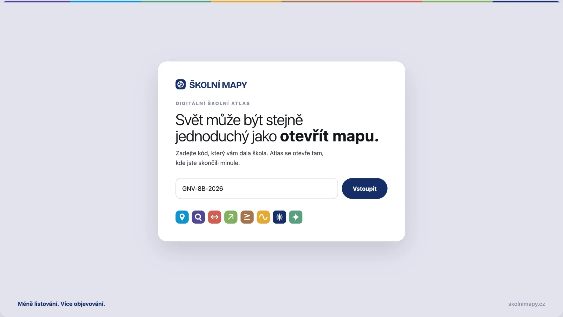
Entry with no account and no password
The pupil gets a code from the school and that is it. No registration, no e-mail, no password to forget. The code carries the class and the subject, so the atlas opens where the class left off. The school also hands over no personal data about its pupils.
Layers instead of twenty different maps
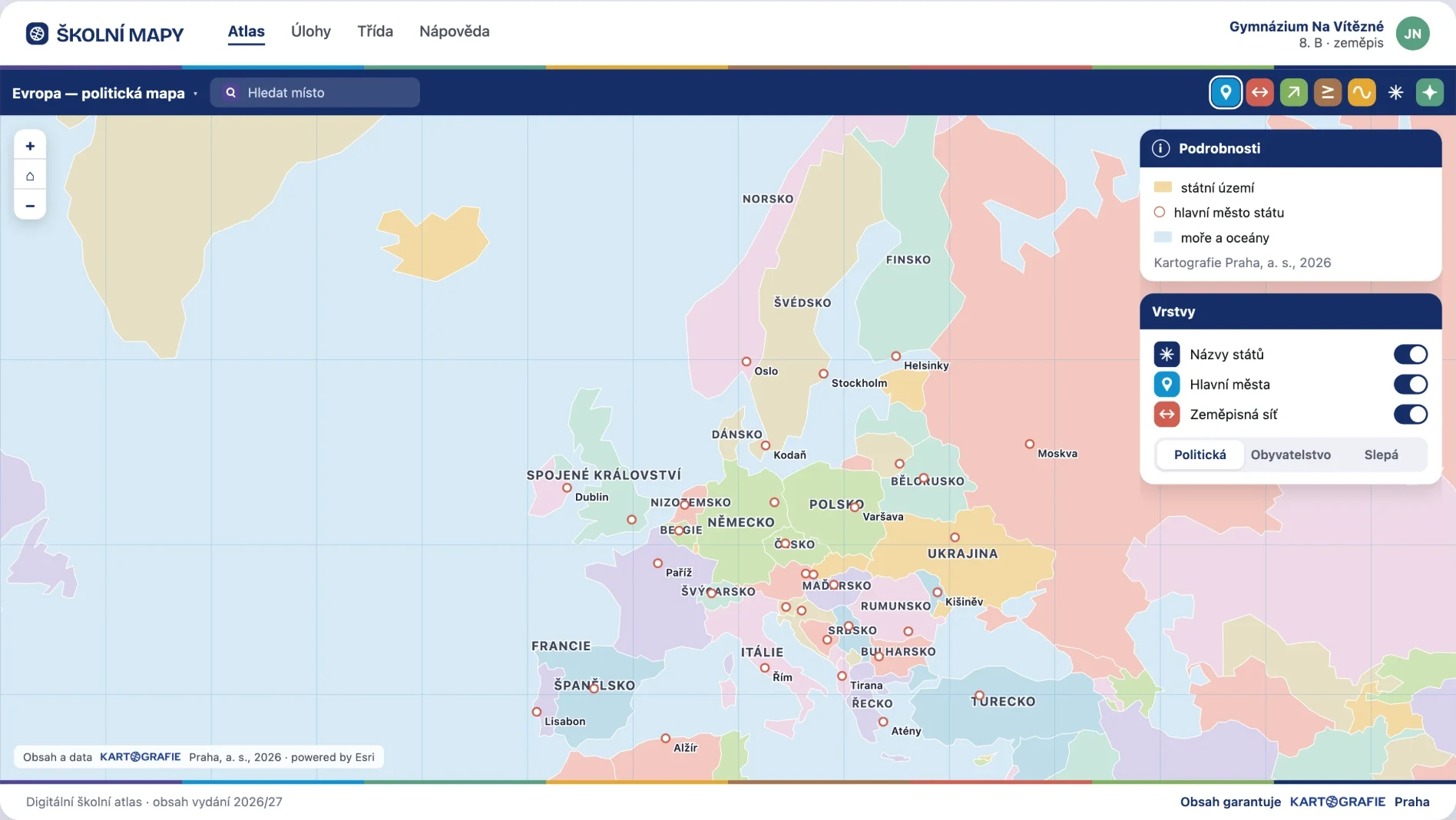
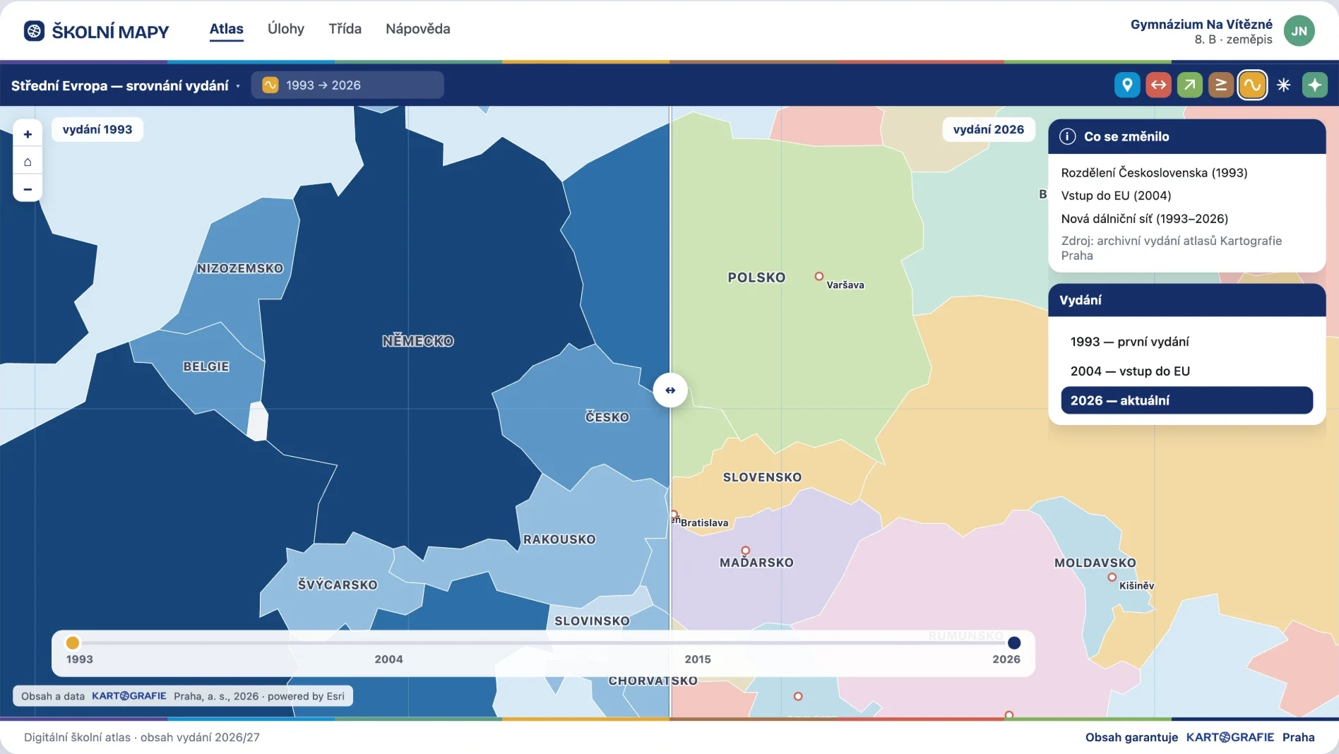
Country names, capitals and the geographic grid switch on separately. That turns one map into a blank map without hunting for another file. The selector below changes the map type: political, population, blank.
Measuring and comparing inside the map
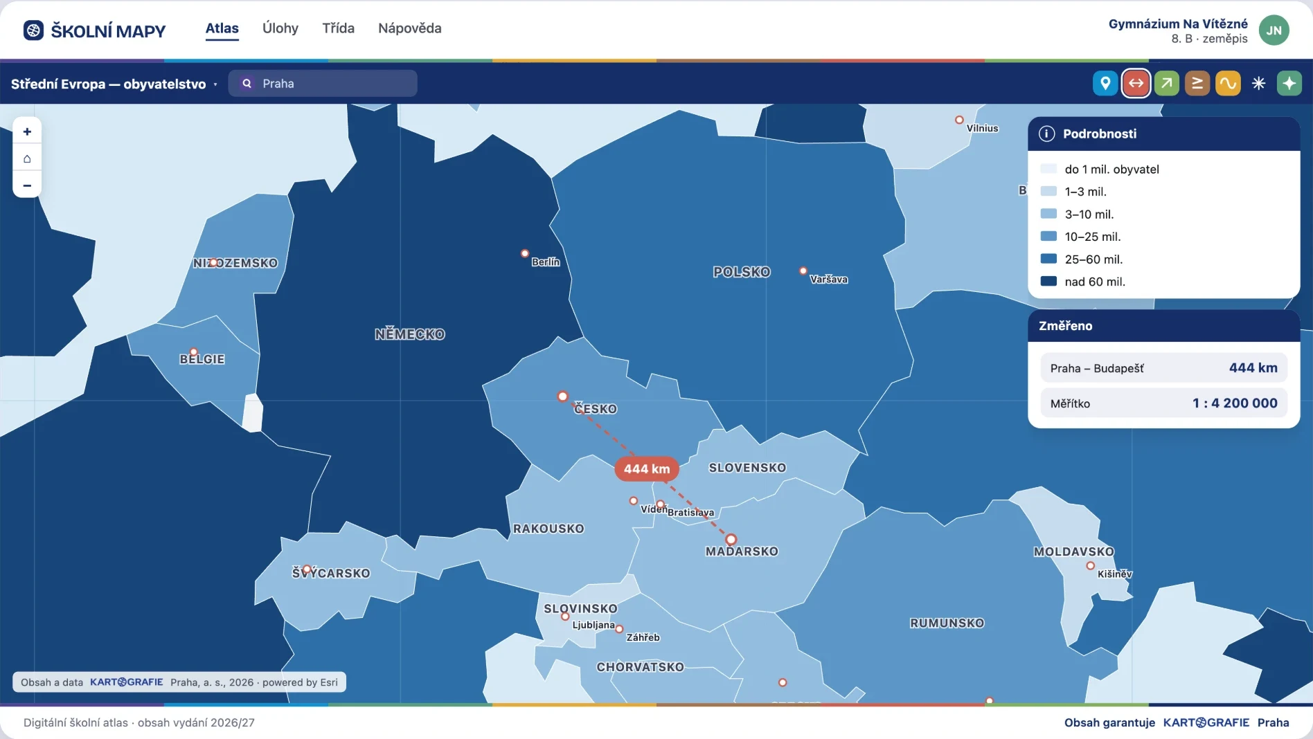
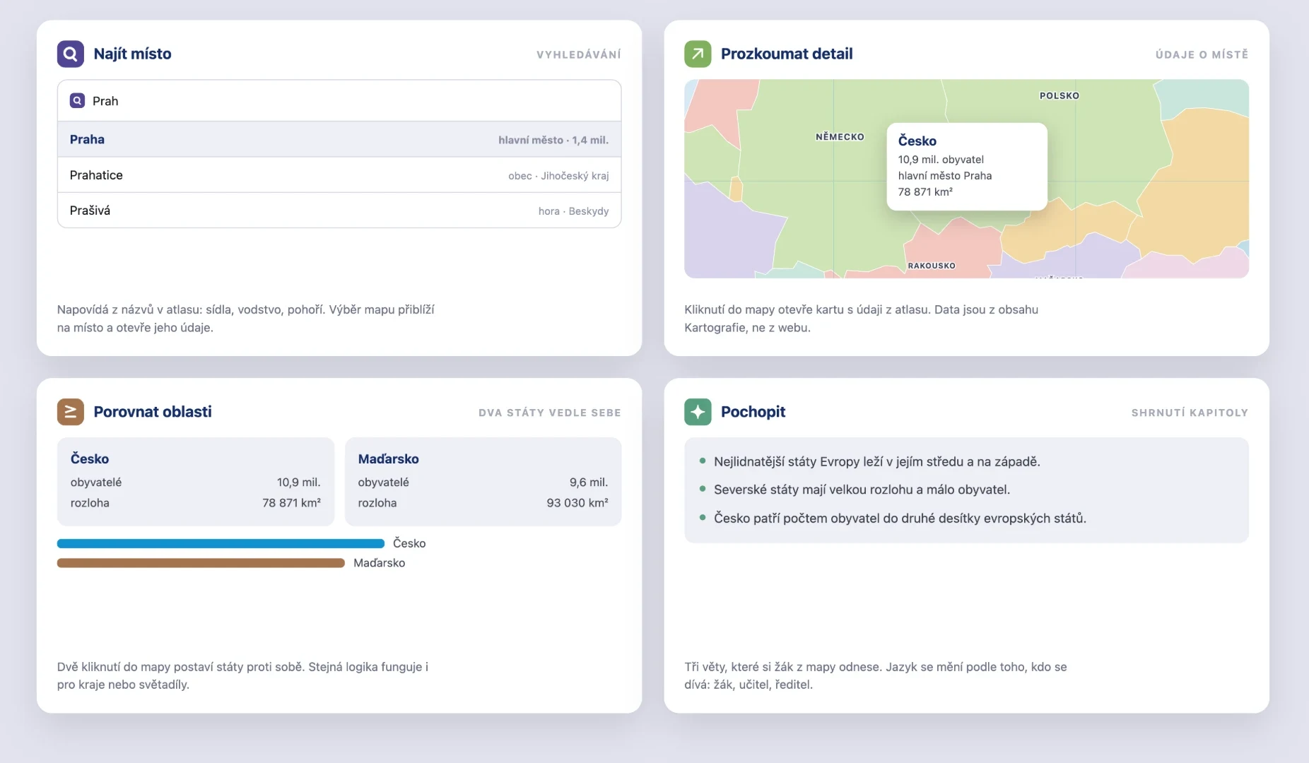
Two clicks measure a distance and show the scale. Two more put a pair of countries side by side with population and area. These are the things a lesson does constantly, and in a paper atlas a ruler and an index stand in for them.
Comparing editions as a teaching aid
A slider between an older and the current edition shows how the map changed over the years. It came out of a remark that the archived atlas editions sit unused. History and geography meet on one screen.
Six parts of the design
Enough scope to estimate the work against.
A map of roles
Pupil, teacher and school administrator. Who sees a class, who sets exercises and who manages the codes. Without it you cannot decide what each screen may do.
Interface states
Tiles loading, a map with no connection, an invalid code, an empty search. In a map application waiting is an ordinary state, not an exception.
Search with suggestions
It suggests from the names in the atlas: settlements, water, mountain ranges. Picking one zooms the map and opens the details, so a search ends in the map, not in a list of results.
Chapter summary
Three sentences a pupil takes away from the map. The wording changes with who is looking: one way for a pupil, another for a teacher.
A Slovak version
Interface and terminology in Slovak. Not a translation added later; it was planned from the start, because it changes how long the labels in the map are.
A scale for colour, type and spacing
Tied to the identity from nkz.studio. The colour bar in the header and footer comes from it, as does the palette of the countries in the map.
Two decisions the design rests on
A school code instead of pupil accounts
Pupil accounts mean holding personal data about minors, resetting passwords and collecting parental consent. A code at class level removes all of that and still does enough to open the atlas in the right place. The price is that you cannot track an individual’s progress; we named that in the design as a deliberate trade-off, not an oversight.
Layers instead of a menu of maps
The obvious move was a list of ready-made maps for the teacher to pick from. Instead there is one map that changes with switches. The teacher does not need to know what each map is called, and a blank map appears mid-lesson in a second.
The client chose a different direction
We did not win the competition. The client paid a sketch fee and went another way, so not even a prototype was built. We therefore have no usage figures, no feedback from teachers and nothing that could pass for a proven result.
We publish it anyway, because it shows what our UX and UI work looks like before anything is programmed: a map of roles, edge states, layers instead of a menu. That is exactly the part we hand over in interface design to teams who build the product themselves.
UX and UI designHave developers and no design?
Tell us what you are building and where your team is now. We reply within two business days.
What else we built
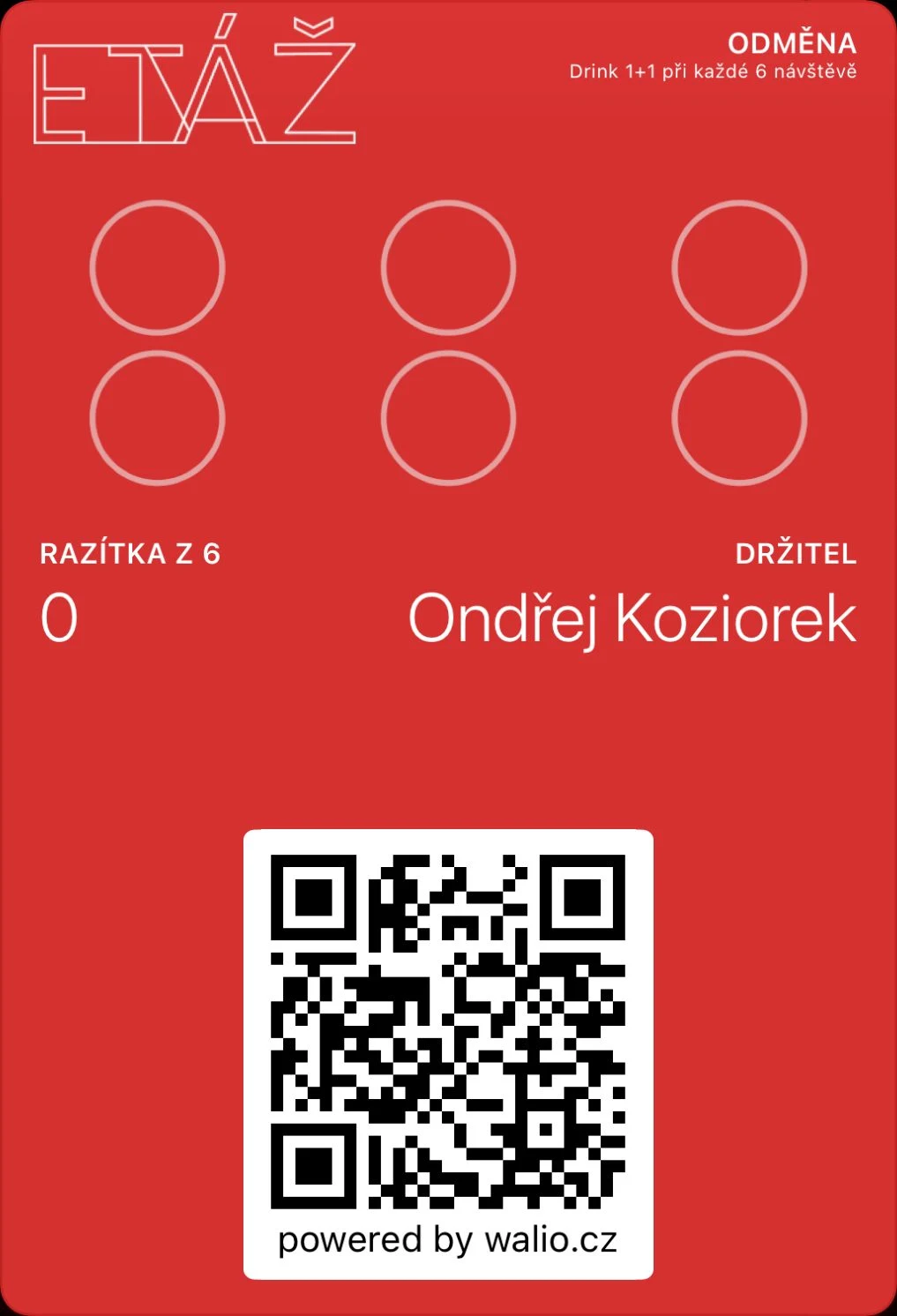 Walio: a loyalty system for businessesA card in the wallet, a terminal for staff and a portal with reporting.
 Branuál: a brand manual as a website, not a PDFPages, blocks and an asset library with publishing. Our own product.
 Layered: a website that sells the course and checks the guest inBooking with live capacity, payment and confirmation in one place.